ogod. Who was it originally who thought it was a good idea to put green/orange/purple circles on the radar?
I customized my radar icons pack so that icons are much smaller on 3D radar. Gives actual readability and minimal overlap, even with a crapload of ships in the field. Doesn't solve the problem that without the lines everywhere, you can't easily judge where the icon's Z coord is at a glance, but personally, I think it's a good tradeoff to immediately tell which dots are cap ships and bombers. Here's a screenshot of sort of what I'm talking about, but I've made some changes since this. (Also, needless to say, smaller icons do not play nice with low screen resolutions)
I removed the in the table the icons for Fighters and Bombers, so that I have a mix of icons for the Big Ships and the old doted lines for Fighters an Bombers, but even that isn't as good readable as your fixed Icons.
Anyway, I am a big fan of the Old Elite-Style Radar. If I could build a 3D Radar, it would look like this:
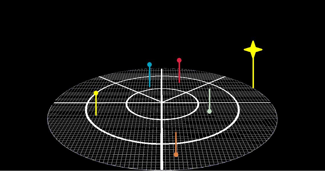
The lines indicate if the Object is above or below of your ship.
Colour does the same, orange = enemy below, light blue = friendly below.
Basic Colours:
Blue = friendly
Yellow = neutral / unknown
Red = enemy
The Star Symbol at the edge indicates the position of the sun, it will never leave the edge.
Nice to have: Similar Symbols for Planets or Moons.
Also nice would to include the Shield Information in the Radar, for Example as Arcs left/right front/aft. Perhaps Thickness or Colour of the Arc indicates Shield Status ?
