Author Topic: 3.6.12 MediaVPs Discussion thread  (Read 105243 times)

0 Members and 3 Guests are viewing this topic.

Offline General Battuta

  • Poe's Law In Action
  • 214
  • i wonder when my postcount will exceed my iq
Re: 3.6.12 MediaVPs Discussion thread
The second one is hideous. It is an abomination of graphic design. It is the vomitous of an untrained mind, and compounded by the availability of tools so corrupted as to make the true craftsman doubt his sanity. It alone is sufficient to undo all the work we as artists have invested into this project.

It is never to be seen again in these forums. Depart, now, from my presense.

The font should be the same color across 3.6.12 and the placement is a bit wonky, and the HLP logo should go, but otherwise I think it's pretty good...


Offline Kolgena

  • 211
Re: 3.6.12 MediaVPs Discussion thread
eh...

You have to remember that the FSO logo will be in the upper left corner. That means the whole screen will be unbalanced and heavier on the left more than it already is. Also, the background of F.S.U is an actual screenshot. That just looks really bad... I mean, somehow all that empty black space and a decidedly unimpressive GTVA logo manage to dwarf the only pretty thing on screen, which is also obscured by text.

It also has a made-in-mspaint vibe to it, though it obviously was made in PS or FW. I just don't know if I could call it good.

 
Re: 3.6.12 MediaVPs Discussion thread
I know this is simply a comment from the peanut gallery and we are simply talking about the splash screen,  but I for one agree completely and is my one complaint with the new Media VPs.  Not to offend all your work Angelus, but these two screens are REALLY bland and uninteresting.  I mean, the Freespace2 logo is fine great for the logo of the FS2O exe, but for as long as I can remember, the splash screen has always been preview for the player of what to expect, showing off some of the hard work the SCP and FSUP has put into this project. Each version progressively getting more and more amazing with each new VP set.  I feel your splash screens don't reflect the overall character of the 3.6.12 set and what I feel as its most obvious, in your face, feature which is its vast improvements in effects. (Not to diminish it's other great accomplishments) The screen used, I feel, is a bit of a let down, especially after the Inspiring Awesomeness that was the 3.6.10 splash screen.  I personally would have preferred that been reused for this set.
« Last Edit: August 09, 2010, 10:45:44 pm by Darklord42 »


Offline Droid803

  • Trusted poster of legit stuff
  • 213
  • /人 ◕ ‿‿ ◕ 人\ Do you want to be a Magical Girl?
    • Skype
    • Steam
Re: 3.6.12 MediaVPs Discussion thread
Oh hey look who's here to save the day:
I made one that looks awesome!\
See all those post-processing shaders on?!


In all seriousness, look at this one, and the current one, and tell me the current one looks cooler.

Don't fix what ain't broken!

At the very least, the new one should be something in this vein, not just some logo with some (sucky) text slapped on or a miniscule picture.
« Last Edit: August 10, 2010, 01:14:50 am by Droid803 »
(´・ω・`)
=============================================================


Offline mjn.mixael

  • Cutscene Master
  • Moderator
  • 212
  • Chopped liver
    • Steam
    • Twitter
Re: 3.6.12 MediaVPs Discussion thread
Maybe something with BEAMS...?

This would not be a final version... it's 1:30AM.. I've had 2 beers and am ready for bed.. I'm surprised I took the time to even TRY to capture this shot.


[attachment deleted by ninja]
Cutscene Upgrade Project - Mainhall Remakes - Between the Ashes
Youtube Channel - P3D Model Box
Between the Ashes is looking for committed testers, PM me for details.
Freespace Upgrade Project See what's happening.


Offline Fury

  • The Curmudgeon
  • 213
Re: 3.6.12 MediaVPs Discussion thread
Personally, I still prefer the .12 splash over those in above posts. :nervous:


Offline General Battuta

  • Poe's Law In Action
  • 214
  • i wonder when my postcount will exceed my iq
Re: 3.6.12 MediaVPs Discussion thread
Oh hey look who's here to save the day:
I made one that looks awesome!\
See all those post-processing shaders on?!


In all seriousness, look at this one, and the current one, and tell me the current one looks cooler.

Don't fix what ain't broken!

At the very least, the new one should be something in this vein, not just some logo with some (sucky) text slapped on or a miniscule picture.

Actually this one's always seemed really ugly to me somehow. It's kind of weird and blurry and...stuff.


Re: 3.6.12 MediaVPs Discussion thread
Hi i made one myself, of course this is only WiP und first Version:


Offline Fury

  • The Curmudgeon
  • 213
Re: 3.6.12 MediaVPs Discussion thread
Sorta okay but that skybox is not in mediavps. Mediavps has no other skyboxes than starfield, which is kinda shame.


Offline Snail

  • SC 5
  • 214
  • Posts: ☂
Re: 3.6.12 MediaVPs Discussion thread
Sorta okay but that skybox is not in mediavps. Mediavps has no other skyboxes than starfield, which is kinda shame.
Yeah I was wondering how ****ing awesome it would be for the retail missions to get some skybox love. I mean LightSpeed's nebulae are great and all but they're looking quite dated nowadays.


Offline petar91

  • 25
Re: 3.6.12 MediaVPs Discussion thread
Hi,

Thanks very much for this new release, with BP WIH it's awesome !!

i have a question, i like the post-processing effect but it AA doesn't work with postprocess effect, is it the same for you  (i have nvidia 8800) ?? is there a solution for it ?

(i search all over this forum and i see screenshots with bloom and no aliasing effect....how ??)


Offline Snail

  • SC 5
  • 214
  • Posts: ☂
Re: 3.6.12 MediaVPs Discussion thread
Hi,

Thanks very much for this new release, with BP WIH it's awesome !!

i have a question, i like the post-processing effect but it AA doesn't work with postprocess effect, is it the same for you  (i have nvidia 8800) ?? is there a solution for it ?

(i search all over this forum and i see screenshots with bloom and no aliasing effect....how ??)
I believe this is a known problem.


Offline The E

  • He's Ebeneezer Goode
  • 213
  • Nothing personal, just tech support.
    • Steam
    • Twitter
Re: 3.6.12 MediaVPs Discussion thread
Yep. You can either have post-processing, OR antialiasing, but not both at the same time.
If I'm just aching this can't go on
I came from chasing dreams to feel alone
There must be changes, miss to feel strong
I really need lifе to touch me
--Evergrey, Where August Mourns


Offline Angelus

  • 210
  • The Angriest Angel
Re: 3.6.12 MediaVPs Discussion thread
Well, the current one was originally made by sigtau, i only changed it a bit.
We did get exact instructions on IRC by Zacam, e.g. no assets from the media vps on the splashscreen, font, textcolour of FSU, textcolour for Mediavps, a.s.o.

Herra Tohtori Requested something completly different, something like this, with a bit of artistic freedom on my end, but with assets from the mediavps:                          
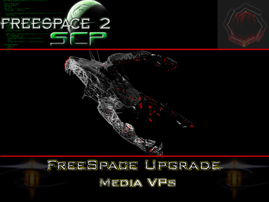


this was an very early WIP, but was discarded almost instantly on IRC by other FSU team members.


The one i previously posted, was also a WIP and i made it because i had two contradicticting "guidelines" on how it is supposed to look.
So i thought, screw that, let's make something that's completly different from the other two approaches.
I did get only positive comments on IRC ( the only thing that was critized was the glow around the plate and the earth bitmap on the plate - too low res).


------------------------------------------------------------------------------------------------------------


None of the other posted splash screens look good ,imo.
While the 3.6.10 one was sure far better then the one currently used, it's not giving anything what one can expect.
How could it? It's totally blurred!
In my opinion Assets shouldn't be shown at all on the Splashscreen.
All that belongs there is, the FSU Logo, the mediavps text and number and the SCP logo.


-----------------------------------------------------------------------------------------------------------


The second one is hideous. It is an abomination of graphic design. It is the vomitous of an untrained mind, and compounded by the availability of tools so corrupted as to make the true craftsman doubt his sanity. It alone is sufficient to undo all the work we as artists have invested into this project.

It is never to be seen again in these forums. Depart, now, from my presense.


thx, i always appreciate constructive criticism.  :P
« Last Edit: August 10, 2010, 07:26:27 am by Angelus »


Offline Snail

  • SC 5
  • 214
  • Posts: ☂
Re: 3.6.12 MediaVPs Discussion thread
I really don't like the red lines and the clearly partitioned space. It lacks both fluidity and elegance.


...Not as good as Galemp. :(


Offline Commander Zane

  • 212
  • Spoot Knight of Anvils
Re: 3.6.12 MediaVPs Discussion thread
Oh hey look who's here to save the day:
I made one that looks awesome!\
See all those post-processing shaders on?!

*Pic*

In all seriousness, look at this one, and the current one, and tell me the current one looks cooler.

Don't fix what ain't broken!

At the very least, the new one should be something in this vein, not just some logo with some (sucky) text slapped on or a miniscule picture.
Except that Thoth isn't HTL. :P


Offline Droid803

  • Trusted poster of legit stuff
  • 213
  • /人 ◕ ‿‿ ◕ 人\ Do you want to be a Magical Girl?
    • Skype
    • Steam
Re: 3.6.12 MediaVPs Discussion thread
Ungh, could you please not have the "FSU MediaBPs 3.6.12" text? Or at least reduce the number of blending options you put onto it.

I like [Wolf]Maverick's, though. It has synergistic colors. It's got some jpg artefacts and could use some blur/anti-aliasing but otherwise looks good. Who cares if the skybox isn't in the mediaVPs. Rainbow text and the logo isn't either... Seriously, you'd rather show absolutely nothing than something cool?

Angelus, that one suffers from Logo Overload. Logo Overload sucks. It makes it look like we have sponsors demanding us to slather their logos all over everything without any thought to if it'd even look good there or something. The red lines don't help either (Oh look, we're partitioning off AD SPACE!)
(´・ω・`)
=============================================================


Offline Mobius

  • Back where he started
  • 213
  • Porto l'azzurro Dolce Stil Novo nella fantascienza
    • Skype
    • Twitter
    • The Lightblue Ribbon | Cultural Project
Re: 3.6.12 MediaVPs Discussion thread
http://www.hard-light.net/forums/index.php?topic=70846.0

Take a look, The E has just found a minor problem in the MVPs.
The Lightblue Ribbon

Inferno: Nostos - Alliance
Series Resurrecta: {{FS Wiki Portal}} -  Gehenna's Gate - The Spirit of Ptah - Serendipity (WIP) - <REDACTED> (WIP)
FreeSpace Campaign Restoration Project
A tribute to FreeSpace in my book: Riflessioni dall'Infinito

 
Re: 3.6.12 MediaVPs Discussion thread
I think it makes sense for the splash screen to show off some cool new feature, like Darklord42 said above. The 3.6.10 splash screen was cool, it did justice to the normal maps (which were one of the main new features of that release).
Notable upgrades in the current MVPs are the HTL Hattie and Cain/Lilith; perhaps a close-up battle between these two could make a good base for a splash screen?


Offline Zacam

  • Magnificent Bastard
  • Administrator
  • 211
  • I go Sledge-O-Matic on Spammers
    • Steam
    • Twitter
    • ModDB Feature
Re: 3.6.12 MediaVPs Discussion thread
Regarding the Splash Screen:

For the next release (whenever that happens to be) I advise people to watch for a WANTED: Graphics Project. MediaVP Splash Screen topic to show up. Because the only people who did answer to it, got what little interaction was provided and made it happen.

I don't see that anybody did anything about it until now, after the fact.
Report MediaVP issues, now on the MediaVP Mantis! Read all about it Here!
Talk with the community on Discord
"If you can keep a level head in all this confusion, you just don't understand the situation"

¤[D+¬>

[08/01 16:53:11] <sigtau> EveningTea: I have decided that I am a 32-bit registerkin.  Pronouns are eax, ebx, ecx, edx.
[08/01 16:53:31] <EveningTea> dhauidahh
[08/01 16:53:32] <EveningTea> sak
[08/01 16:53:40] * EveningTea froths at the mouth
[08/01 16:53:40] <sigtau> i broke him, boys